150 sidor
På English
Publicerades 21 april 2011 av A Book Apart.

150 sidor
På English
Publicerades 21 april 2011 av A Book Apart.
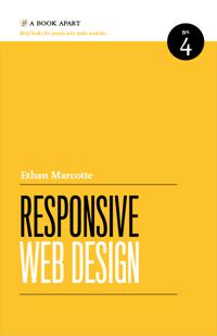
From mobile browsers to netbooks and tablets, users are visiting your sites from an increasing array of devices and browsers. Are your designs ready? Learn how to think beyond the desktop and craft beautiful designs that anticipate and respond to your usersâ needs. Ethan Marcotte will explore CSS techniques and design principles, including fluid grids, flexible images, and media queries, demonstrating how you can deliver a quality experience to your users no matter how large (or small) their display.
